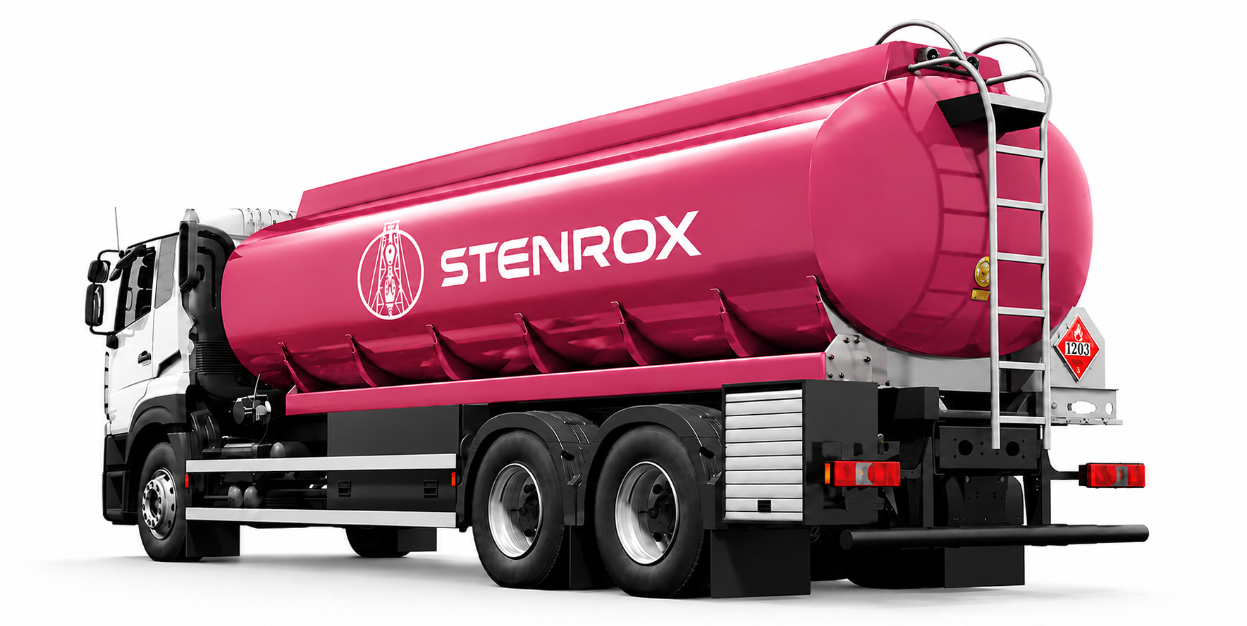
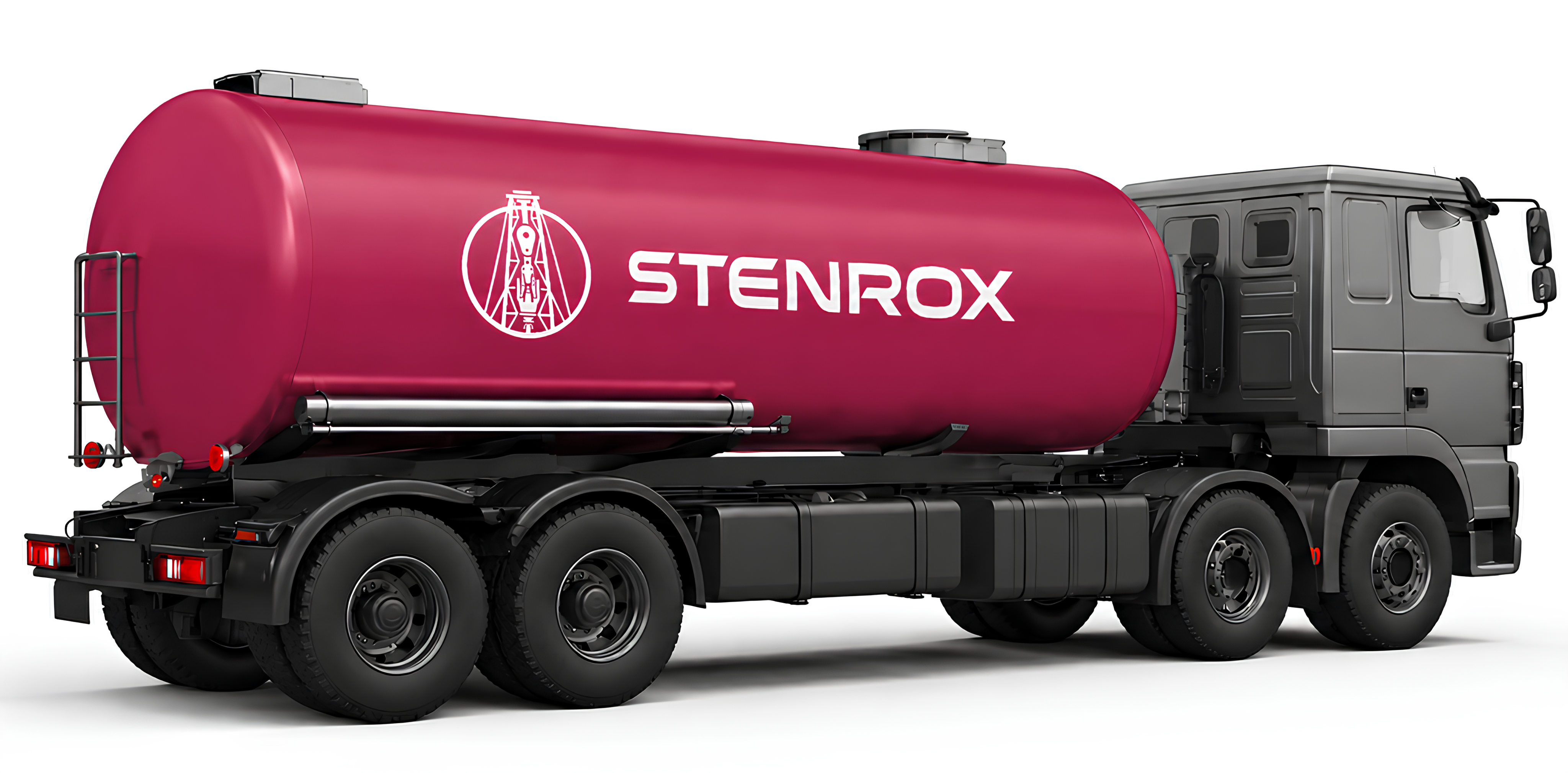
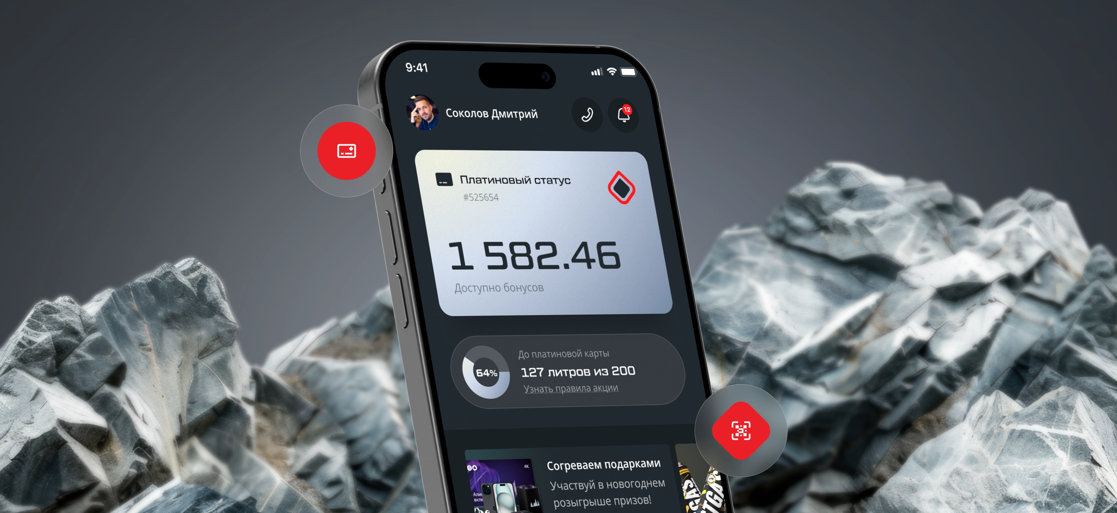
STENROX — branding from scratch.
2025 year
Services
- Services
- Logo
- Visual identity
- Brand guidelines
- Brand applications
Industries
- Oil and gas
A new company
A complex industry.
High stakes from day one.
STENROX specialises in oil well drilling. It is entering the international market from scratch: no track record, no visual identity, but strong technical expertise. Its target audience includes oil and gas corporations, field operators and infrastructure contractors.
In this industry, a company’s appearance signals reliability before negotiations even begin. A weak identity in a tender presentation is enough to raise doubts about a contractor’s credibility. From the very first slide, the company needed to look like a partner that could be trusted with a well.
The starting point
No existing visual identity. Just a name, the team’s technical expertise and the ambition to enter the international drilling market.
The brief
A logo mark, a complete identity system and brand guidelines for tender presentations, international negotiations and corporate documentation.
02 — Audience and market
Oil and gas is one of the world’s most conservative markets.
STENROX’s clients are technical directors, heads of drilling operations and procurement committees at oil and gas corporations. They work with the industry’s largest service companies and immediately spot any mismatch between claimed expertise and the quality of a company’s visual presentation.
Visually, the market falls into two camps: heavyweight corporate giants and indistinct regional contractors. STENROX needed a clear third position: technical precision with a recognisable character.
-
Major industry service companies
Heavy, corporate, distant
-
Regional drilling contractors
Generic, dated visuals
-
STENROX
Precise, reliable, international
Process
From industry research to brand guidelines delivery.
Industry research
We studied the visual language of oil, gas and drilling companies around the world. We mapped out which visual cues communicate technical reliability in this industry and which suggest an amateur approach.
Logo mark development
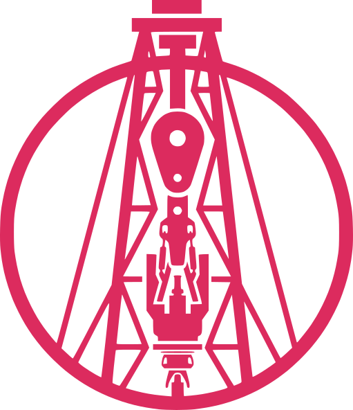
We tested literal drilling symbols and abstract monograms. The final design is the silhouette of a drilling rig drawn with fine lines inside a circle. The mark combines technical character with graphic elegance.
Colour and typography
We rejected oil-black as the dominant colour because it made the brand feel heavy and anonymous. The main accent is a deep raspberry red, replacing the expected black or blue. The typeface is Gotham Pro, a geometric sans serif in multiple weights.
Brand guidelines and applications
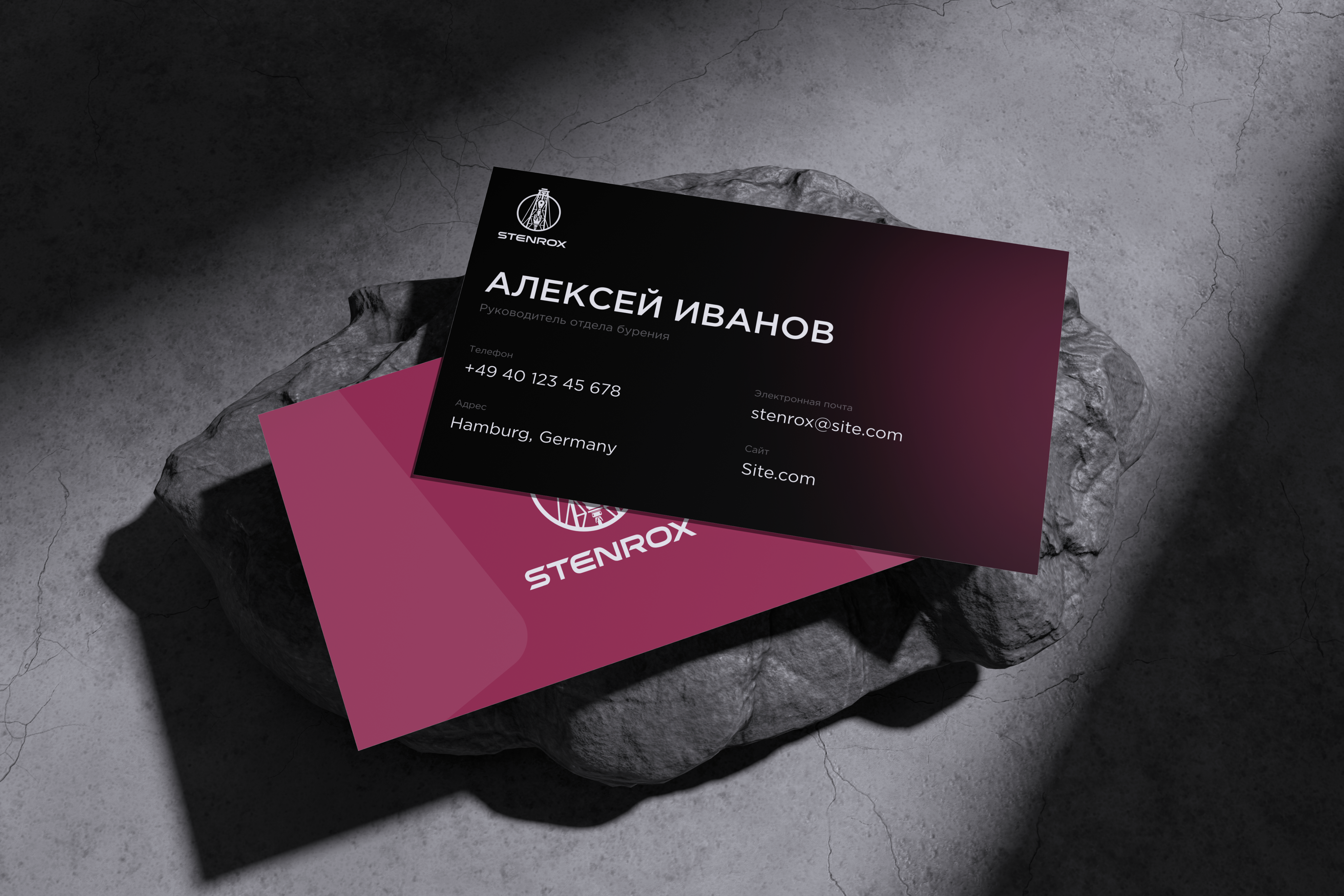
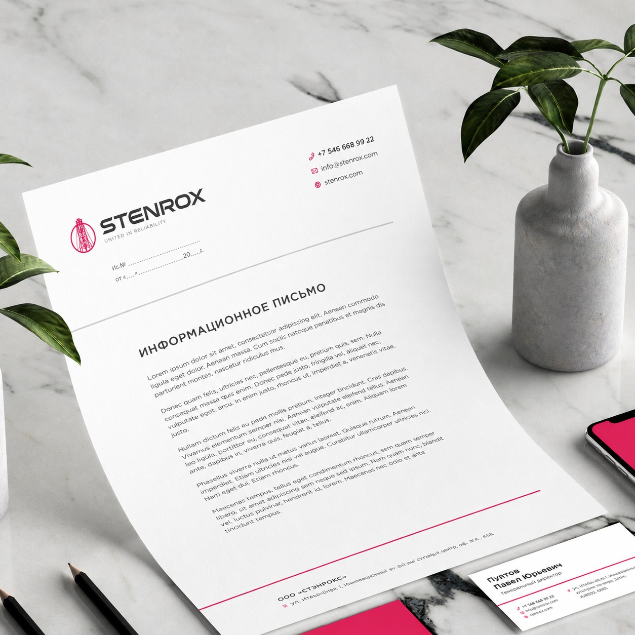
We brought the mark, palette, typeface and usage rules together in a single guide. We designed a business card and letterhead, and defined basic rules for avoiding incorrect logo use.
- 1-2Weeks
Research
- 3-5Weeks
Logo concepts
- 6-7Weeks
Final mark
- 8-9Weeks
Identity system
- 10Week
Guidelines delivered

Logo
A mark with engineering precision in every line
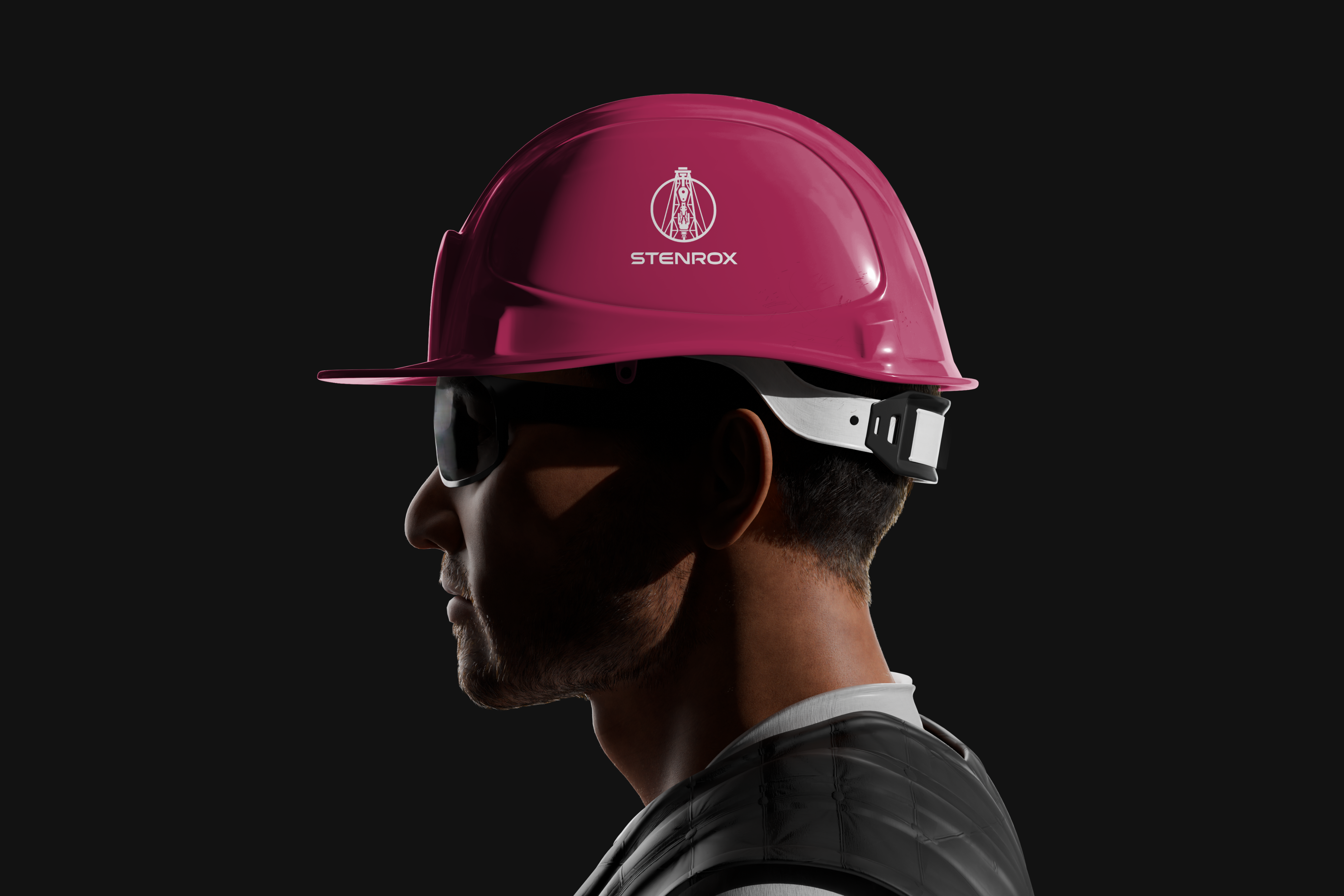
The brand mark is a drilling rig silhouette constructed from fine lines and enclosed in a circle. The name is set in the wide geometric sans serif Gotham Pro, with the tagline “United in Reliability” beneath it in small, widely spaced capitals. The design works both as a complete logo and as a standalone mark without text.




Visual system
Three colours. One typeface. A precise system.
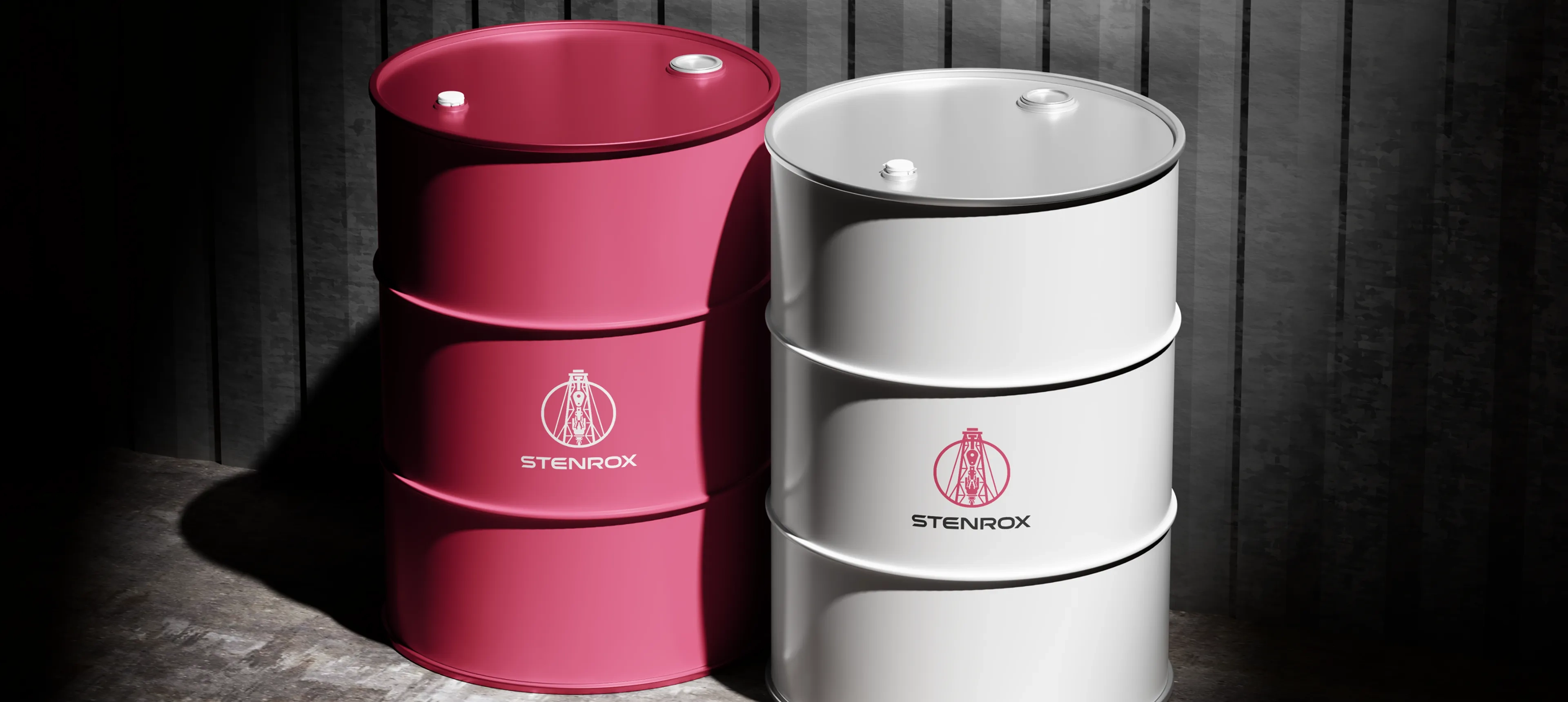
Raspberry red is the main accent: unexpected in oil and gas, and memorable for that very reason. Dark graphite and neutral grey support documentation and secondary elements. This palette distinguishes STENROX from the industry’s typical black-and-blue visual language.
Raspberry
RGB: 181, 44, 91
HEX: #B52C5B
Graphite
RGB: 65, 65, 70
HEX: #414146
Grey
RGB: 158, 158, 158
HEX: #9E9E9E


Visual system
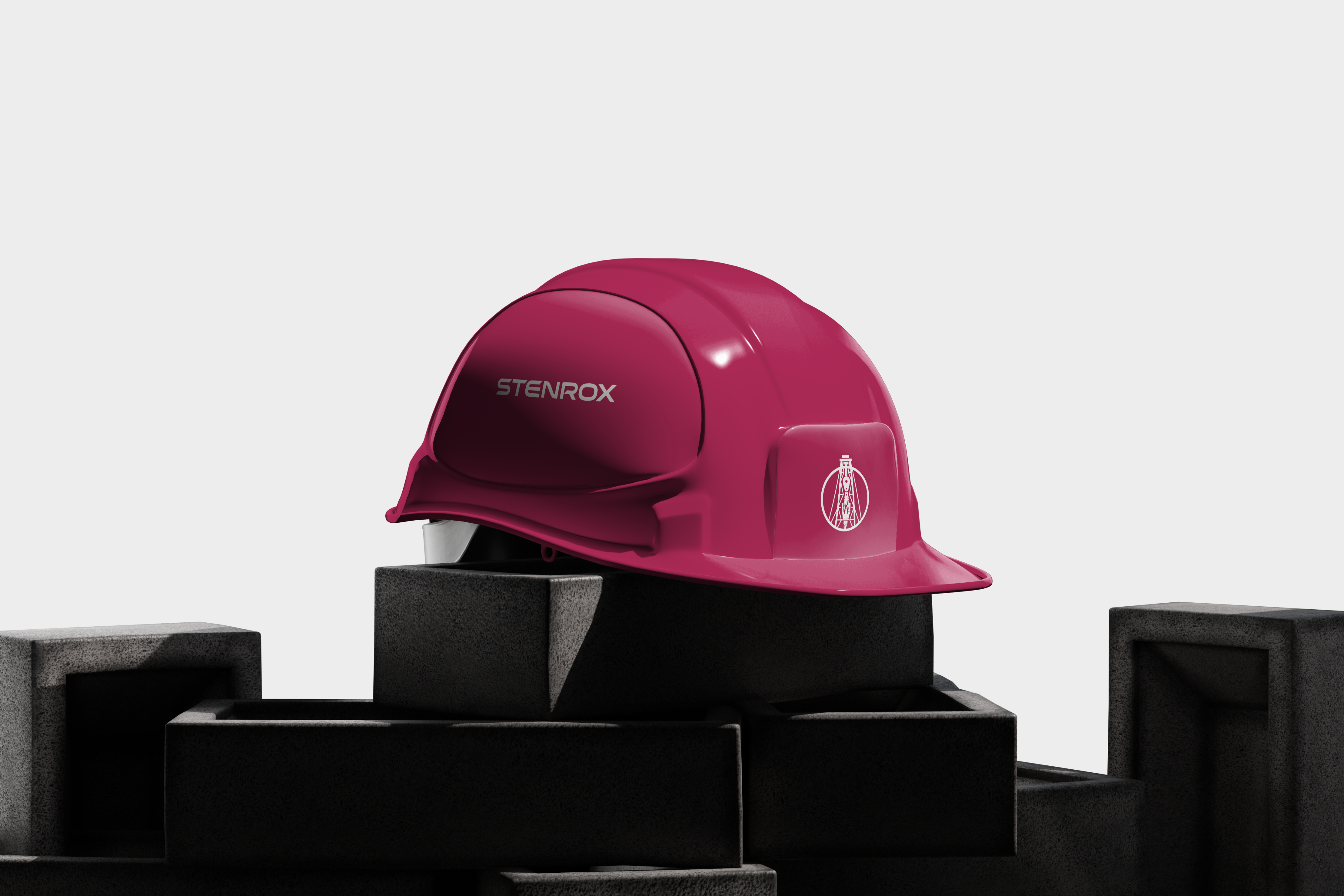
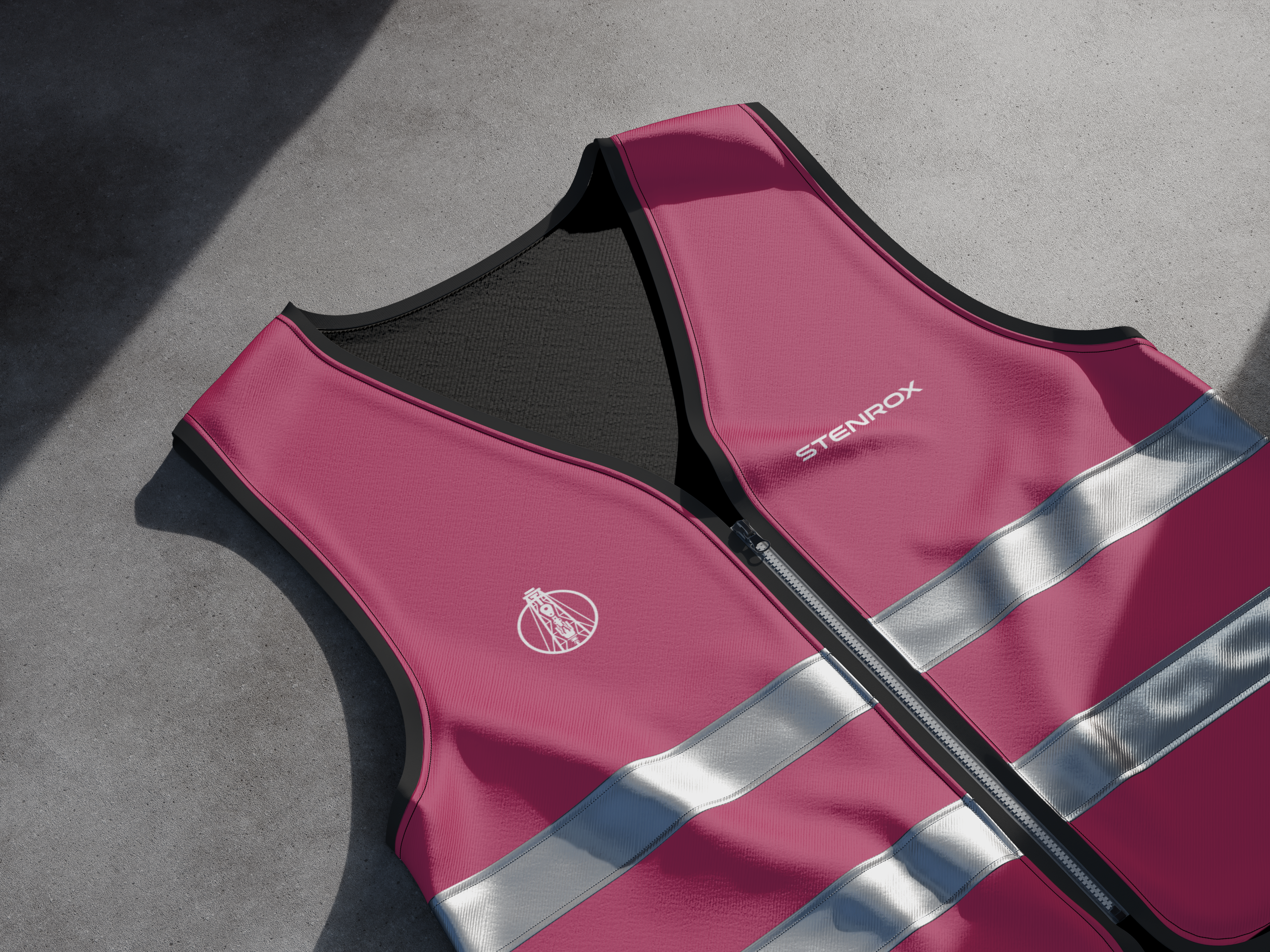
The system in action