


Why accessibility is not "about people with disabilities"
In 2026, accessibility in design ceased to be a niche topic. It is not a separate item at the end of a project and not a "checkbox for compliance." Accessibility directly affects conversion, user retention, SEO, and legal risks.
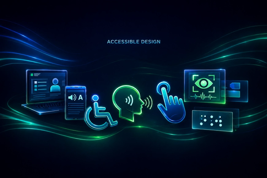
Today, accessibility means the ability of an interface to be understandable, manageable, and predictable for the widest possible audience:
people with visual and hearing impairments, users with motor limitations, elderly people, as well as those who interact with the product in non-standard conditions — on mobile, in poor lighting, with one hand, or without sound.
For digital products, accessibility is part of design quality. If the interface is inconvenient or inaccessible, the business loses users regardless of how beautiful the UI was.
The business impact of accessibility
One of the main mistakes is to consider accessibility as an additional burden on the team. In practice, it is quite the opposite: an accessible interface reduces the number of errors, increases engagement, and expands the audience.
Accessibility affects:
- conversion growth due to clear scenarios,
- reduction of bounce rates,
- improvement of SEO (structure, semantics, readability),
- compliance with regulatory requirements.
Our team regularly encounters projects where fixing accessibility issues yields measurable effects even after the first iterations.
Basic Principles of Accessible Design
Before moving on to the checklist, it is important to establish the basic principles. They are the foundation of the WCAG standards but are applicable even without a formal audit.
1. Perceivability
The user must see or hear the information.
2. Operability
The interface must be accessible for control in various ways.
3. Understandability
The behavior of the interface must be predictable.
4. Reliability
The interface must work correctly with different devices and assistive technologies.
Accessibility Checklist in Design
Below is a practical checklist that can be used when designing and reviewing interfaces.
Colors and Contrast
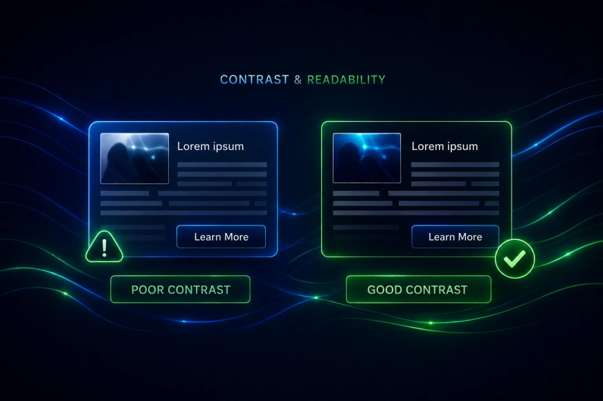
One of the most common issues is insufficient contrast between text and control elements.
Check:
- Is the contrast between text and background sufficient,
- Can the interface be read without color (for example, in black-and-white mode),
- is the meaning conveyed only by color (error, status, warning).
Typography
Text — the primary carrier of information in digital products.
Checklist:
- the minimum text size is sufficient for reading,
- line spacing is not too tight,
- there are no long unreadable lines,
- headings logically structure the content.
Navigation and Focus
The interface should be controllable not only by mouse or touch.
Check:
- is keyboard navigation available,
- is the focus of the active element visible,
- is the order of focus logical,
- are there any "traps" that cannot be exited without a mouse.

Forms and Errors
Forms — one of the most critical areas for accessibility and conversion.
Checklist:
- Are the field labels clear,
- Do error messages describe the problem in text, not just color,
- Do errors not reset the entered data,
- Are there hints and examples of input format.
Table 1. Common form errors and their consequences
|
Error |
Consequence for the user |
Impact on business |
|
Error indicated only by color |
User does not understand the problem |
Loss of conversion |
|
Data reset on error |
Frustration |
Leaving the form |
|
No text description |
Not accessible for screen readers |
Legal risks |
Animations and Motion
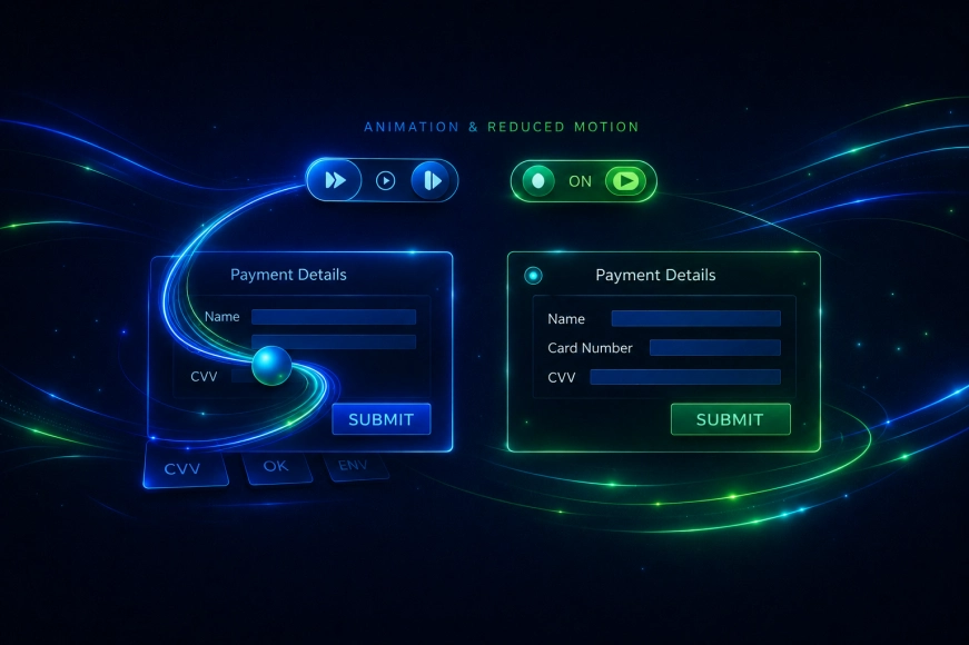
Animation enhances UX, but when used incorrectly, it worsens accessibility.
Check:
- can animation be disabled,
- does motion cause discomfort,
- is animation used as the only way to convey meaning.
Content and Language
Even a visually accessible interface can be complicated due to language.
Checklist:
- texts are written in plain language,
- there are no overloaded terms without explanations,
- instructions and CTAs are clear,
- microcopy helps, not confuses.
Accessibility and Design System
If the product is evolving, accessibility cannot be maintained manually on every screen. It must be integrated into the design system.
Table 2. Accessibility as part of the design system
|
Element |
What should be considered |
|
Buttons |
Contrast, size, focus |
|
Forms |
Errors, labels, hints |
|
Typography |
Scalability |
|
Colors |
Contrasting pairs |
|
Animations |
Alternative states |
When and how to check accessibility
Accessibility cannot be "checked at the end". It must be considered:
- at the UX design stage,
- during the development of the design system,
- during development,
- during testing.
In RUSO team projects, accessibility is considered part of product quality, not an additional option.
Final Checklist
Before the release, ask yourself the questions:
- Can the user understand the interface without color?
- Can key scenarios be completed without a mouse?
- Are errors and hints clear?
- Is the text scalable?
- Is accessibility considered in the design system?
If the answer to some questions is «no» — there is a risk of losing users.
Conclusion
Accessibility in design is not a limitation for creativity, but a tool for improving product quality. Interfaces that consider different usage scenarios work more reliably, are clearer, and are more effective for business.