


Why the mobile interface is not a reduced version of the web
One of the most common mistakes in mobile application development is transferring web logic and interfaces to the mobile screen "in a reduced form." In 2026, this approach almost certainly leads to problems with retention, conversion, and user perception of the product.
The mobile interface is an independent product layer with its own scenarios, limitations, and user expectations. It exists under the conditions:
- small screen;
- touch control;
- short sessions;
- contextual use (on the go, between tasks, one-handed).
Therefore, designing mobile interfaces requires a separate approach, in which UX, business goals, and technical constraints work together.
In this article, we will discuss how we design mobile interfaces and what principles we consider critical for modern applications.

Where to start designing a mobile interface
Design begins not with screens and not with the UI kit. The first stage is understanding usage scenarios.
We always answer the questions:
- why the user opens the app;
- in what context this happens;
- what actions they want to perform the fastest;
- which scenarios are repeated daily;
- where the user loses focus or time.
The mobile interface should accelerate key actions, not just look good.
Mobile UX as a priority system
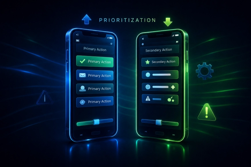
In a mobile interface, it is impossible to show everything at once. Therefore, the key principle is strict prioritization.
We highlight:
- core scenarios (product core);
- secondary actions;
- rare features.
In the interface, this is expressed through:
- screen hierarchy;
- element placement;
- number of steps to the target action;
- visual accents.
If in the mobile interface "everything is important," then nothing is important.
Designing for real gestures and behavior
Mobile interfaces are designed for fingers, not for cursors.
Key points we consider:
- thumb reach zones;
- using gestures instead of buttons;
- minimizing small elements;
- predictable navigation patterns.
It is especially important to consider one-handed use, which has become the standard for most users.
Navigation: fewer levels — more clarity
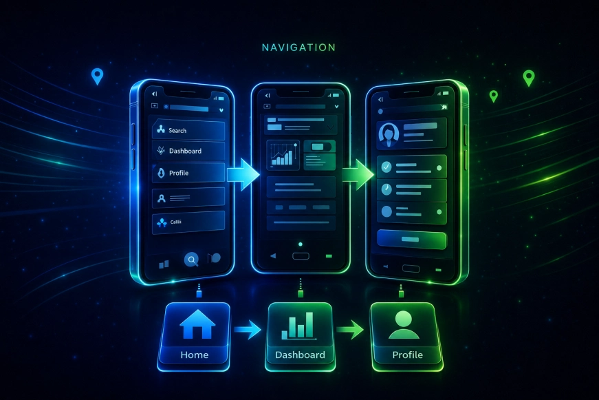
Complex navigation — one of the main reasons for failures in mobile applications.
We adhere to the principles:
- minimum number of nesting levels;
- clear separation of sections;
- clear transitions;
- absence of "lost" screens.
Navigation should be so obvious that the user doesn't think about it at all.
Content and text in mobile interfaces
In mobile interfaces, text works differently than on the web.
Key principles:
- short formulations;
- clear meaning at first glance;
- avoidance of long paragraphs;
- the use of microcopy.
Text in the mobile application is part of the interface, not a separate content layer.
Animations and Feedback
Animations in mobile interfaces are not needed for "beauty," but for:
- explaining transitions;
- confirming actions;
- creating a sense of responsiveness;
- reducing cognitive load.
We use animations carefully so that they:
- do not slow down the interface;
- did not distract from tasks;
- enhanced understanding of what is happening.
Table 1. The Role of Animations in Mobile UX
|
Type of Animation |
Purpose |
|
Transitions |
Understanding Structure |
|
Feedback |
Confirmation of actions |
|
Micro-interactions |
Increasing responsiveness |
|
Loading |
Reducing anxiety |
Designing for platform constraints
We always consider the characteristics of the platforms:
- iOS and Android have different UX patterns;
- system elements differ;
- user expectations differ.
Designing mobile interfaces without considering platform guidelines almost always leads to the feeling of a «foreign» application.
Our team adheres to the principle: single logic — platform UX.
Testing mobile interfaces
Design does not end with mockups.
We must:
- test prototypes;
- check scenarios with real users;
- see where errors occur;
- measure task completion speed.
The mobile interface should be not only clear but also fast in real usage.
Table 2. What we check during testing
|
Parameter |
Why |
|
Execution time of the scenario |
Effectiveness |
|
Number of errors |
Clarity |
|
User Journey |
Optimality |
|
Gesture Response |
Comfort |
Common Mistakes in Mobile Interfaces
- Transferring web logic without adaptation
- Overloaded screens
- Too small elements
- Complex navigation
- Ignoring the context of use
These errors are rarely visible in layouts, but immediately manifest in real usage.
Why we design mobile interfaces this way
Our approach is based on a simple principle: the mobile interface should help the user achieve their goal faster than any alternative method.
To achieve this, we:
- start with scenarios, not screens;
- prioritize actions;
- consider the context of use;
- we test and improve the interface iteratively.
The RUSO team views the mobile interface as part of the product strategy, not just as a visual layer.
Conclusions
Designing mobile interfaces in 2026 is:
- working with constraints;
- clear prioritization;
- deep understanding of scenarios;
- balance of UX, business, and technology.
Products that perceive the mobile interface as a standalone product, rather than as a web adaptation, succeed.