


A logo — is not just a picture «for beauty». It is a tool for recognition, trust, and navigation in the digital environment. In 2026, brands exist in interfaces: in mobile applications, SaaS dashboards, marketplaces, presentations, widgets, social networks, and in countless variations of adaptive screens. Therefore, the question «logo: when does it need an update» becomes critical not because «it is fashionable», but because channels, the speed of communication, and identity requirements are changing.
In this article, we will analyze when a logo update is truly necessary, how to avoid the trap of «let's redesign for the sake of redesign», what signals indicate a problem, and how to approach the task so that branding updates become an investment in growth rather than a cost without effect.
1) Context 2026: why the topic has become more acute
Several factors make branding in 2026 particularly demanding of logos:
- Interface Reality. The logo almost always exists in a small size: in the favicon, in the website header, on the product card, in the channel avatar, in the mobile menu. In such formats, complex shapes, thin details, and "artistry" simply stop working.
- Growth of Competition and Uniformity. The digital market is overheated: IT services, SaaS, consulting, development — visual languages are quickly repeated. If the logo is "like everyone else's," it does not fulfill the main task — to distinguish.
- New Rules of Trust. The user reads the quality of the product through external signals. If the visual system looks outdated, the brain automatically transfers this to the product: "if the logo is old — then everything inside is probably not very good."
- Scaling the Business. The company is growing, new directions, audiences, and products are emerging. A logo created for one scenario begins to "interfere" with expansion.
2) Main signals that it's time to update the logo
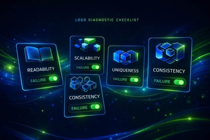
Updating the logo is a decision that should be based on symptoms. Below are the signs that we most often see in identity and branding development projects for IT companies.
Signal #1. The logo does not work well in digital media
If the logo "falls apart," becomes unreadable, or turns into an amorphous blob at a small size, this is a technical reason for an update. This is especially relevant for SaaS and products where the icon and favicon are constantly visible.
Signal #2. The company has grown — the logo is still "about yesterday"
Rebranding is often needed when a business has transformed from a studio/startup into a mature digital agency, product company, or ecosystem. The old sign may convey the wrong scale: "small" meanings, not the right level, not the right audience.
Signal #3. The logo is not distinguishable in the market
The problem is not that the logo is «unliked». The problem is that it cannot be recognized and described. If the visual image is typical, the brand loses part of its marketing effectiveness: advertising is more expensive, recognition is lower, and trust is built more slowly.
Signal #4. There is no unified standard within the company
When different departments use different versions: someone stretches the sign, someone changes colors, someone draws a “similar” one — this is a signal that the logo and the system around it have not survived the reality of growth.
Signal #5. A new product / new segment has emerged
You are launching a new SaaS, entering e-commerce, or creating a separate line of IT services — and the old logo does not scale in meaning and style.
Table 1: “Symptom → cause → what to do” (key, leave it)
|
Symptom |
What does it mean |
Recommended action |
|
In small size, the sign is unreadable |
The logo is not adapted for digital |
Redrawing, simplifying the shape, creating adaptive versions |
|
The logo looks "outdated" |
The visual code does not match the market |
Update of style, typography, and composition |
|
Logo “like everyone else” |
No differentiation |
Reconceptualization of brand meaning and visual language |
|
No standards, chaos in application |
Lack of brand system |
Brand book/guidelines, usage rules, variability |
|
New product does not “fit” |
Logo is not scalable |
Brand architecture + system of signs/versions |
3) How to approach the update correctly: not to "redesign", but to solve the problem
Mistake #1 — to perceive the logo update as exclusively a design task. In branding, it is almost always a mix of strategy, meaning, and engineering practicality.
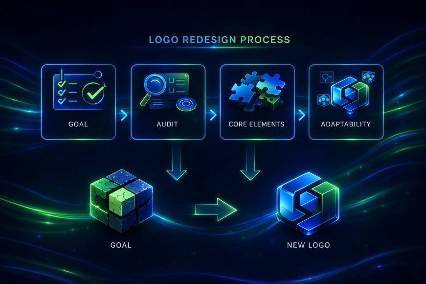
The correct process usually looks like this:
- Define the goal of the update.
Not "to make it modern", but specifically: to increase recognition, simplify use in interfaces, support entry into a new market, eliminate visual noise, build brand architecture. - Audit of the current identity and carriers.
Where and how the logo currently exists: website, social media, app icon, merchandise, presentations, UI components. At this stage, it is often clear why the system is “breaking”. - Defining the unchangeable.
What cannot be lost during the update: recognizable shape, character, color, typography, or part of the semantic metaphor. This is critical if the brand is already known. - Designing adaptability.
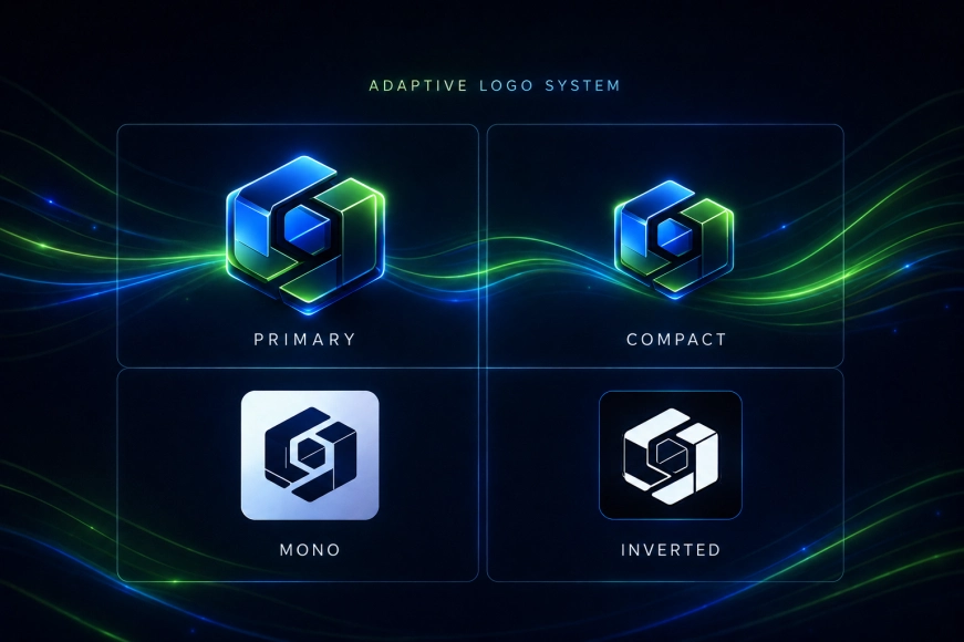
In 2026, a logo is rarely “just one image”. Usually, versions are needed: main, compact, icon, monochrome, inversion.
4) Typical mistakes when updating a logo
Mistake 1. “Let’s make minimalism” without meaning
Minimalism is not a goal. The goal is clarity, recognizability, and working in mediums. Sometimes minimalism helps, sometimes it kills character.
Error 2. A sharp break from past recognizability
If you lose the brand's "anchors" (form, rhythm, character) — you reset the accumulated trust. This is permissible, but it should be intentional.
Error 3. Updated the logo — forgot about the system
One sign does not solve the branding task. Without typography, colors, compositional rules, UI patterns, and guidelines, it quickly turns into chaos.
Error 4. No metrics and criteria for success
After updating the logo, it is important to assess effectiveness: recognizability, engagement, conversion on key screens, growth of trust in the funnel.
5) Practical recommendations: what to do to ensure the update yields results
- Start by defining the task in business terms.
For example: “increase trust in B2B”, “support entry into e-commerce”, “raise awareness among IT directors”. - Tie the design to the product.
The identity of an IT company should relate to what you do: development, SaaS, digital services, analytics, transformation. The visual language should be honest. - Create a set of versions for digital.
Favicon/icon/monochrome/inversion/compact version — this is not “additional options”, but a mandatory minimum. - Fix the rules in the brand book or guideline.
Even a short guide of 10–15 pages often saves the brand from degradation after six months.
Table 2: “Update vs Redesign vs Rebranding” (the second key table)
|
Option |
When it is suitable |
Risk |
Result |
|
Logo update |
Needs adaptation for digital, improvement of readability |
Low |
Improvement of performance on media without loss of recognizability |
|
Redesign of identity |
Logo is okay, but the system is outdated/chaotic |
Average |
Unified visual language, growth of trust |
|
Rebranding |
Change of positioning/audience/product |
High |
New identity and communication, possible loss of old recognition |
6) Conclusions: when updating the logo is truly justified
The topic «logo: when an update is needed» in 2026 is about practicality and efficiency. If the logo does not exist in digital media, does not scale with the business, does not distinguish you in the market, or there is no unified standard within the company — updating becomes not a “beautiful project,” but a tool for growth.
Let me emphasize once: the RUSO team always starts with diagnostics and goals in such tasks, rather than with “let's redesign it.” This approach helps to update logos without losing recognizability and with a clear effect for branding and sales.