


Why UI errors in SaaS are more expensive than they seem
In SaaS products, the user interface is not just a "wrapper" over functionality. UI directly affects whether the user can understand the product, start using it, and stay with it for a long time. Unlike project solutions, SaaS relies on reuse, which means every UI error scales to thousands of users.
In 2026, the user:
- is not ready to deal with complex interfaces;
- expects predictable patterns;
- compares the experience not with competitors, but with the best digital products in general;
- leaves silently, without explaining the reason.
Therefore, UI errors in SaaS are not a matter of aesthetics. This is losses in activation, retention and LTV.
In this article, we will discuss:
- the most common UI errors in SaaS products;
- why they occur;
- how to avoid them during the design and development stage of the product.
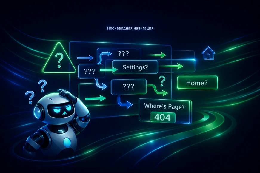
Error #1. Overloaded interface at startup
One of the most common mistakes is the attempt to show the user everything at once. In SaaS, this happens especially often: the product grows, functionality increases, and the interface starts to “inflate”.
Consequences:
- the user gets lost;
- doesn't understand where to start;
- doesn't reach the first result;
- leaves without figuring it out.
A good UI in SaaS is not a demonstration of capabilities, but managing the user's attention.
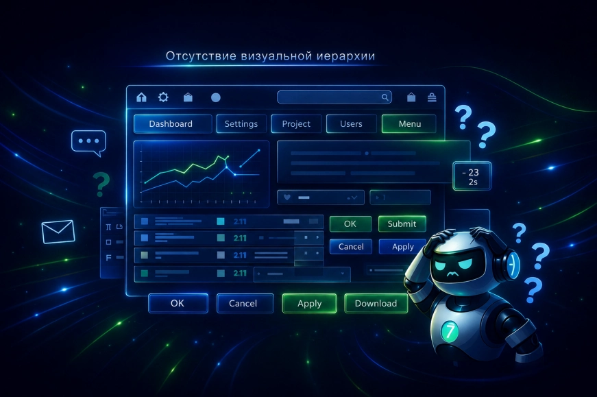
Error #2. Lack of visual hierarchy
If everything in the interface looks equally important — nothing is important.
Typical manifestations:
- identical buttons for actions of different significance;
- lack of emphasis;
- overloaded screens;
- weak typography.
Without a clear visual hierarchy, the user spends energy not on working with the product, but on trying to understand the interface.
Error #3. The UI does not support user scenarios
One of the key problems of SaaS interfaces is the gap between product logic and real usage scenarios.
Examples:
- important actions are hidden deep within the interface;
- rare features are brought to the forefront;
- user scenarios do not match the navigation.
The UI must follow the user's logic, not the internal structure of the product.
Error No. 4. Ignoring the context of use
SaaS products are used:
- by different roles;
- for different purposes;
- at different times;
- on different devices.
The same UI logic for all users almost always leads to problems:
- some features turn out to be unnecessary;
- some are inaccessible;
- the interface becomes "averaged" and inconvenient.
Context is one of the key factors for quality UI in SaaS.

Error #5. Weak handling of interface states
UI — is not just the «main state». The user constantly encounters:
- downloads;
- errors;
- empty states;
- action confirmations.
Typical mistakes:
- lack of feedback;
- unclear errors;
- «empty» screens without explanations;
- lack of confirmations.
Well-designed states make the product predictable and reliable in the eyes of the user.
Table 1. UI States and Their Meaning
|
State |
What the user feels |
|
Loading |
Understanding the process |
|
Error |
Situation control |
|
Empty state |
Understanding the next step |
|
Success |
Confidence |
Error No. 6. Complex interface language
In SaaS products, it is often used:
- internal terms;
- technical jargon;
- abstract formulations.
For the user, it looks like:
- misunderstanding of what is happening;
- fear of making a mistake;
- decreased trust in the product.
UI texts — are part of the interface, not auxiliary content. They should be simple, clear, and contextual.
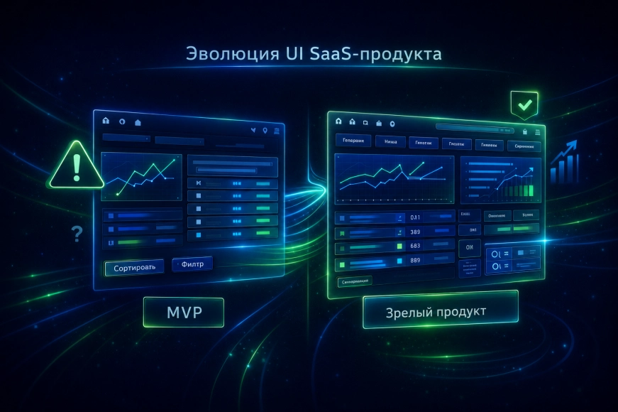
Error #7. Lack of UI adaptation as the product grows
UI that worked at the MVP stage rarely suits a mature SaaS.
As it grows:
- scenarios change;
- new segments appear;
- depth of usage increases.
If the UI does not evolve with the product, it begins to hinder growth.
UI Errors and SaaS Metrics
UI issues almost always reflect in the metrics:
- low activation rate;
- high churn;
- weak feature adoption;
- increased support load.
Important: users rarely write "the interface is inconvenient." They simply stop using the product.
How we approach UI in SaaS products
Our approach is based on the principle: UI is a tool for achieving user goals.
We:
- design the interface from scenarios;
- build a visual hierarchy;
- consider roles and context;
- develop states and texts;
- regularly review the UI as the product grows.
The RUSO team views UI as a living part of the SaaS product, not as a final layer.
Conclusions
UI errors in SaaS products in 2026 are:
- user losses;
- decreased conversion;
- increased support;
- slowed product growth.
Those SaaS platforms that win are the ones that:
- design UI consciously;
- think in scenarios, not screens;
- regularly improve the interface;
- perceive UI as a strategic asset.