


Introduction: why identity for digital products is not about the "logo"
Creating a brand identity for digital products is one of the most undervalued tasks in branding. Identity is still often perceived as a set of visual elements: logo, colors, fonts. However, in the context of digital products, identity is a system that directly influences interface perception, user trust, and product effectiveness.
Unlike classic offline branding, the identity of digital products lives within interfaces, interaction scenarios, and microdetails. It must work dynamically, scale, adapt to different platforms, and remain recognizable.

How the identity of a digital product differs from classic brand identity
The classic corporate identity was historically created for offline environments: print, packaging, outdoor advertising, media. In digital products, the logic changes. Here, not only visual expressiveness is important, but also functionality.
The identity of a digital product must:
- be user-friendly;
- not interfere with navigation and reading;
- scale from mobile screens to dashboards;
- work in light and dark themes;
- be compatible with the design system.
If the corporate style hinders the use of the product — it is bad identity, even if it looks impressive.
Branding as part of user experience
In digital products, branding does not exist separately from UX/UI. It directly influences:
- the speed of interface perception;
- the sense of product reliability;
- the emotional reaction of the user;
- the recognizability of the service among competitors.
Through branding, the user reads the character of the product: whether it is strict or friendly, innovative or conservative, mass-market or niche. These feelings are formed not by a single logo, but through a system of visual solutions.

Key elements of digital product identity
Identity for digital products is built around several basic components that must be thoughtfully designed systemically.
Color system
Colors in digital products are not just a brand palette. They are a system of states: primary actions, secondary elements, errors, success, background, accents. The color system should be flexible and accessible, considering contrast and accessibility requirements.
Typography
Fonts in a digital product work under load. They must be easily readable on different screens, support different languages, weights, and usage scenarios. Typography is one of the strongest carriers of identity in the interface.
Graphics and illustrations
Icons, illustrations, and graphic elements form the visual language of the product. It is important that they are stylistically unified and do not conflict with the functional elements of the interface.
Identity and Design System: Where the Boundary Lies
One of the common mistakes is to separate identity and design system. In digital products, they should be closely related.
Identity is responsible for character and visual identity.
The design system is responsible for rules and scalability.
Good identity:
- is easily translated into design system components;
- does not break with product growth;
- supports the development of new features.
Common mistakes when creating identity for digital products
- Identity for the sake of beauty
When the visual style looks impressive but hinders product usability. - Lack of a system
There is a logo and colors, but no rules for their application in the interface. - Ignoring scaling
Identity works on the first screen but breaks when the product grows. - Copying trends
Using trendy solutions without considering the character and tasks of the product.
Branding and Business Results
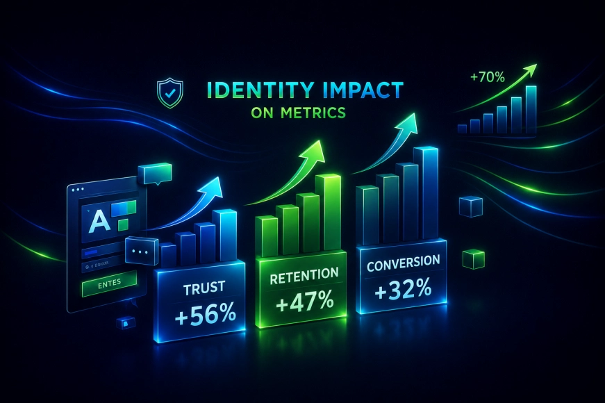
The branding of a digital product directly affects business metrics:
- trust in the product;
- user retention;
- conversion;
- brand perception in the market.
A user may not realize why they feel comfortable working with a product, but the visual system plays a key role in this. That is why branding is not a "decor," but a tool.
How We Approach Creating Branding for Digital Products
In our team, branding is considered part of the product, not a separate design artifact. We start with understanding the business tasks, audience, and use cases, and only then move on to visual solutions.
This approach allows us to create branding that not only looks modern but also works within complex digital ecosystems.
Conclusions
Creating a corporate identity for digital products is a complex task that lies at the intersection of branding, UX/UI, and product thinking. Branding must be systematic, scalable, and functional.
A digital product can be technically perfect, but without thoughtful branding, it loses part of its value in the eyes of the user. That is why working with branding should start not with the logo, but with understanding how the product will live and develop in the digital environment.