


Introduction: why "identity 2026" is not about beauty, but about efficiency
In 2026, visual identity ceased to be the "cover" of the brand. It is a working system that affects recognition, trust, conversion, and even customer acquisition cost. The market is overheated: there are too many visual solutions, and audience attention is too scarce. Therefore, the task of identity in 2026 is not to "be beautiful," but to be distinguishable, scalable, and manageable.
It is important to understand the trends of visual identity in 2026 not as a list of fashionable techniques, but as a response to real changes: the development of digital channels, the increase in content production speed, the emergence of new formats (3D, motion, generative graphics), and the business demand for predictable results. Below is a systematic analysis of which "branding trends" are truly useful and which often turn into expensive decoration.
1) Context: what has changed in branding by 2026
1.1 Identity has become a "system," not a set of carriers
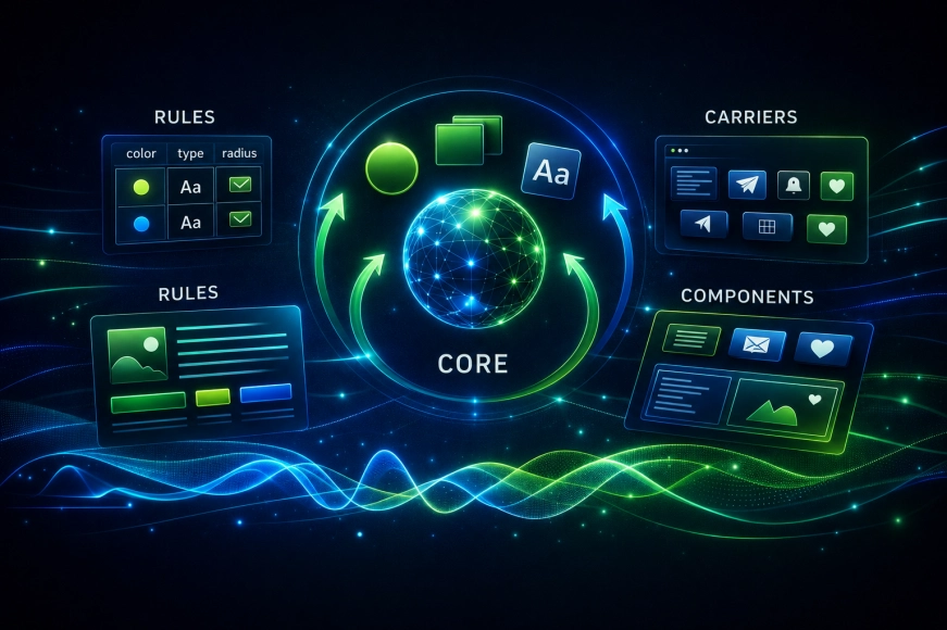
Previously, the brand was often perceived as a logo + corporate style + «how to design presentations». In 2026, branding is a design system: rules, tokens, grids, typography, component library, motion principles, approach to illustrations and 3D. This is necessary for the brand to exist across all channels: website, social media, interfaces, e-commerce, presentations, videos, advertising.
1.2 The digital environment has become the main carrier
The website, product interfaces, and content on social media are the main «contact points». Therefore, visual identity in 2026 is designed with consideration of:
- scalability of content (many formats, many sizes),
- production speed (the team should not «redraw» each banner),
- adaptation for motion and interactivity.
2) Main trends in visual identity in 2026
Important: a trend becomes useful only when it solves a business problem (recognition, trust, speed of content production, distinctiveness in the category). Below are the trends that most often yield tangible effects in the digital environment.
2.1 «Living» gradients and complex light (but disciplined)
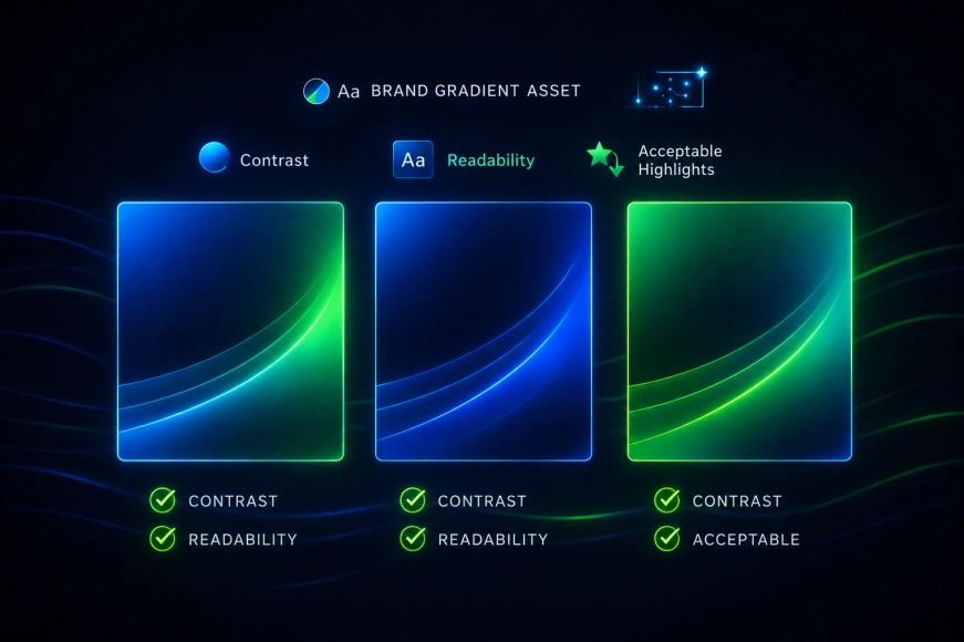
Gradients have returned not as «background for the sake of background», but as a way to create depth, atmosphere, and recognition. In 2026, brands that can do this systematically win: they fix the palette, type of lighting scenarios, intensity, and contrast rules.
2.2 Typography as the main carrier of character
Fonts and composition are increasingly becoming stronger than illustrations. In 2026, typography is not «font selection», but a set of principles: hierarchy, rhythm, density, behavior in interfaces, rules for headings and micro-text.
2.3 Moderate 3D / glassmorphism as a «premium layer»
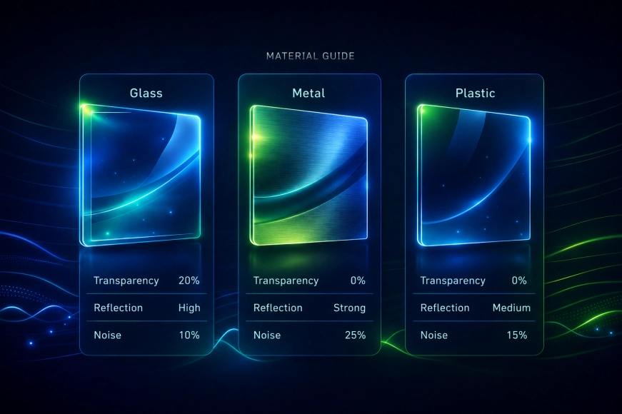
Subtle 3D and glass effects in 2026 work where a sense of technology and modernity is needed (especially for IT services, SaaS, digital agency). The key is not to overdo it and integrate into the system: materials, reflections, transparency, noise level.
2.4 Brand as a «set of modules»: design system and tokens
The trend for 2026 is the transition of branding to a modular system format: brand tokens, component library, content templates. This speeds up production, reduces the cost of owning branding, and decreases «visual debt» (analogous to technical debt, but in design).
3) Table: what has really changed in branding by 2026 (comparison)
This table helps business and marketing quickly understand: the trends of 2026 are not embellishments, but a different way to manage the visual system.
|
Identity Component |
2020–2023 |
2026 |
|
Logo |
«brand center» |
part of the system (important, but not alone) |
|
Corporate Style |
set of media |
design system + tokens + templates |
|
Content |
hand-drawn graphics |
scaling through modules/components |
|
Digital |
secondary |
primary (website/product/social media) |
|
3D / motion |
«upon request» |
standard for tech brands (moderately) |
|
Consistency |
«whatever works» |
regulations, control, visual QA |
4) Where companies go wrong by following trends
4.1 «Copied the style» instead of creating an identity
The most common mistake is to take a popular visual presentation (gradients/3D/neon) and hope that it will «make the brand modern». But a trend without a system has the opposite effect: the brand becomes indistinguishable from hundreds of similar ones.
4.2 No scaling rules
Identity «in the moment» can look great, but if there are no templates and tokens — after 2–3 months the visuals start to fall apart. A visual debt arises: different shades, different shadows, different typography, «every designer in their own way».
4.3 Too complex graphics that cannot be produced quickly
In 2026, speed is important: content, releases, updates. If the style requires a lot of manual work — it breaks under load.
5) Table: how to choose trends — by effect, risks, and complexity
This table helps make decisions without 'fashion' and debates of 'like/dislike'.
|
Trend |
Brand Effect |
Risks |
Implementation Complexity |
|
Live Gradients |
Recognition, Atmosphere |
Readability Decreases with Overuse |
Average |
|
Typography in the Foreground |
Character, Clarity |
composition discipline needed |
average |
|
Moderate 3D / glass |
technological, premium |
quickly becomes obsolete without a system |
average/high |
|
Design system + tokens |
speed, consistency |
requires processes and control |
high (but pays off) |
|
Generative graphics |
uniqueness, variability |
«noise» without art direction |
high |
[6) Practical output: how companies can implement identity trends in 2026
- Start with tasks, not with style: recognition, trust, conversion, content production speed.
- Build a system: tokens, rules, templates, examples, limitations.
- Incorporate "quality control": design review, guidelines, checking layouts before publication.
- Think about the digital environment: how the style works on the website, in the interface, in the mobile version, in social media.
- Add complexity gradually: first typography and composition, then 3D/motion as a "layer".
Conclusions
Trends in visual identity in 2026 — it's not "the gradient trend" and not "mandatory 3D". The main trend — transforming identity into a managed system that helps the brand to be distinguishable, speeds up content production, and maintains consistency in the digital environment.
Branding 2026 wins where there is discipline: design system, rules, and understanding why each visual technique is needed. If all this exists — trends work for business. If not — they turn into expensive decor and create visual debt.