


Why the product card is the main driver of conversion in e-commerce
The product card is the decision-making point. It is here that the user either understands the value of the product and makes a purchase or leaves. In 2026, competition in e-commerce is so high that the product card has ceased to be just a page with a description — it is a full-fledged sales UX tool.
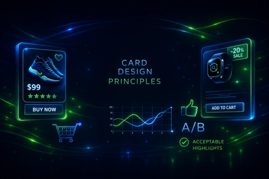
Practice shows: improving the product card often gives a greater increase in conversion than any marketing experiments. The reason is simple — the card directly answers the user's questions, reduces doubts, and removes barriers.
In this article, we will analyze key UX patterns that really work in product cards and explain why they are important right now.

What are UX patterns and why are they needed
UX patterns — are proven solutions to user tasks that:
- meet user expectations;
- reduce cognitive load;
- accelerate decision-making;
- increase conversion.
Important: UX patterns — are not templates «for everyone». They work only when adapted to a specific product, audience, and business goals.
Pattern No. 1. Visual Product Priority
The first thing a user evaluates is the visual. If the product image does not provide a complete understanding, conversion drops regardless of price and conditions.
Working UX approaches:
- large images without visual noise;
- multiple angles;
- zoom capability;
- a unified visual style for the catalog.
The user must "see" the product before they start reading the text.
Pattern No. 2. Clear value proposition
The product description should answer not the question "what is it", but the question "why do I need this".
Effective cards:
- highlight the key benefit above technical specifications;
- use clear language, not marketing clichés;
- immediately show who the product is for and in what scenarios it is useful.
Technical details are important, but they work after the user understands the value.
Pattern No. 3. Transparent pricing without surprises
Price — one of the most sensitive elements of the product card. Any uncertainty here reduces trust.
Good practice:
- immediately show the final cost;
- indicate the availability of discounts and promotions without fine print;
- explain what makes up the price (if appropriate).
Hidden fees and "pop-up" surcharges almost always lead to abandonment of purchase.
Table 1. How price affects conversion
|
Approach |
Impact on the user |
|
Transparent price |
Increases trust |
|
Hidden surcharges |
Reduces conversion |
|
Clear actions |
Accelerate decision |
|
Non-obvious conditions |
Cause refusal |
Pattern No. 4. Trust through social proof
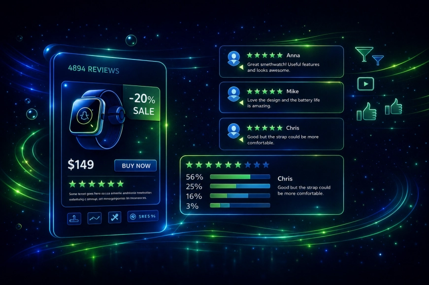
Reviews and ratings — one of the strongest UX triggers.
Effective product cards:
- show reviews next to the price or CTA;
- allow filtering reviews;
- highlight real use cases;
- do not completely hide negativity.
Paradoxically, 100% positive reviews evoke less trust than honest and lively feedback.
Pattern No. 5. Minimizing Efforts When Purchasing
Every unnecessary action reduces the likelihood of purchase. In 2026, users expect:
- minimum clicks;
- clear CTA;
- no complex forms;
- predictable interface behavior.
Working solutions:
- the «Buy» button is always in the visible area;
- fixed CTA when scrolling;
- clear statuses (in stock / on order).
Pattern No. 6. Delivery and return as part of UX
Delivery and return conditions — not legal text, but an element of user experience.
Best practices:
- show delivery times immediately;
- specify return conditions without going to a separate page;
- use icons and short phrases.
The less uncertainty, the higher the conversion.
Table 2. UX Patterns and Their Impact
|
Pattern |
Effect |
|
Visual Priority |
Increased Engagement |
|
Clear Value |
Accelerated Decision |
|
Social Proof |
Increased Trust |
|
Minimum Actions |
Increased Conversion |
|
Transparent Conditions |
Reduced Abandonment |
Pattern No. 7. Adaptation for Mobile Users
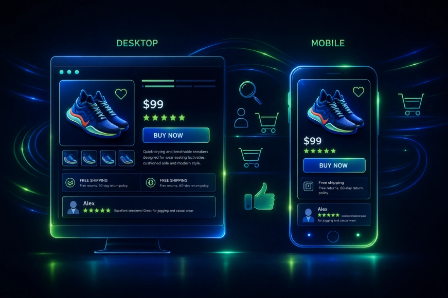
The mobile product card is not a reduced version of the desktop one.
Common mistakes:
- small elements;
- overloaded screen;
- complex swipes;
- hidden CTAs.
Mobile UX requires prioritization: leave only what really affects the decision.
Analytics and testing instead of intuition
Even the best UX patterns do not work without testing. Mature e-commerce projects:
- analyze user behavior;
- test hypotheses;
- measure the impact of changes;
- iteratively improve product cards.
Our team in such projects always considers the product card as a living interface, not a static page.
- Information overload
- Lack of clear hierarchy
- Weak visuals
- Unclear CTA
- Ignoring mobile UX
UX patterns for product cards are not trendy tricks, but the result of years of practice and analysis of user behavior. In 2026, the e-commerce projects that succeed are those that:
- understand the audience's expectations;
- design interfaces consciously;
- testing hypotheses;
- constantly improving user experience.
The product card — is the point where UX directly turns into money.