1%
2025 year
Services
Industries
STENROX is a company specializing in oil well drilling. It is entering the international market from scratch: with no history and no visual language, but with serious technical expertise. The target audience is oil and gas corporations, field operators, and infrastructure contractors.
In this industry, a company's appearance signals reliability before negotiations even begin. A weak identity on a tender presentation is already a reason to doubt a contractor's seriousness. From the very first slide, the company had to look like one you can entrust with a well.
A completely blank visual foundation. A name, the team's technical expertise, and the goal of entering the international drilling market.
A mark, a complete system, and a brand book — for tender presentations, international negotiations, and corporate documentation.
02 — Audience and market
STENROX's clients are technical directors, heads of drilling operations, and procurement committees at oil and gas corporations. They work with the industry's largest service companies and instantly spot any mismatch between claimed expertise and the visual quality of the presentation.
The market is visually split into two camps: heavy corporate giants and faceless regional contractors. STENROX needed to take a clear third position — technically rigorous, yet with a recognizable character.
Heavy, corporate, inaccessible
Faceless, outdated visuals
Precise, reliable, international
Process
We studied the visual language of oil and gas and drilling companies around the world. We built a map of meanings: what this industry reads as "technical reliability" and what reads as amateurism.
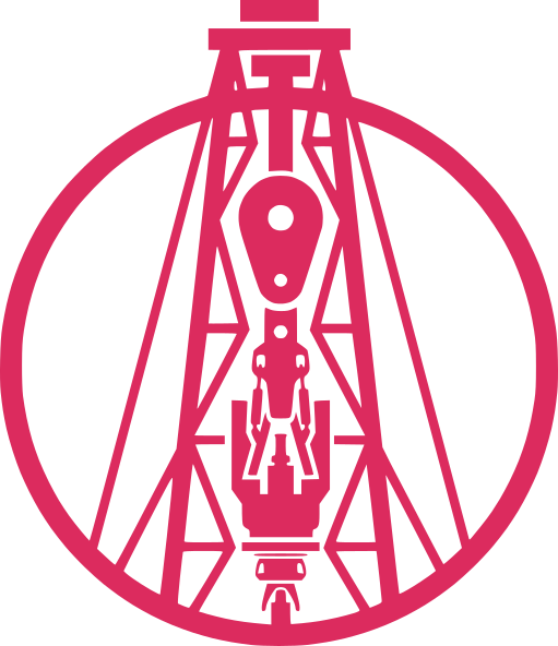
We tested literal drilling symbols and abstract monograms. The final choice is the silhouette of a drilling rig set within a circle in a thin line. The mark is both technical and graphically elegant.
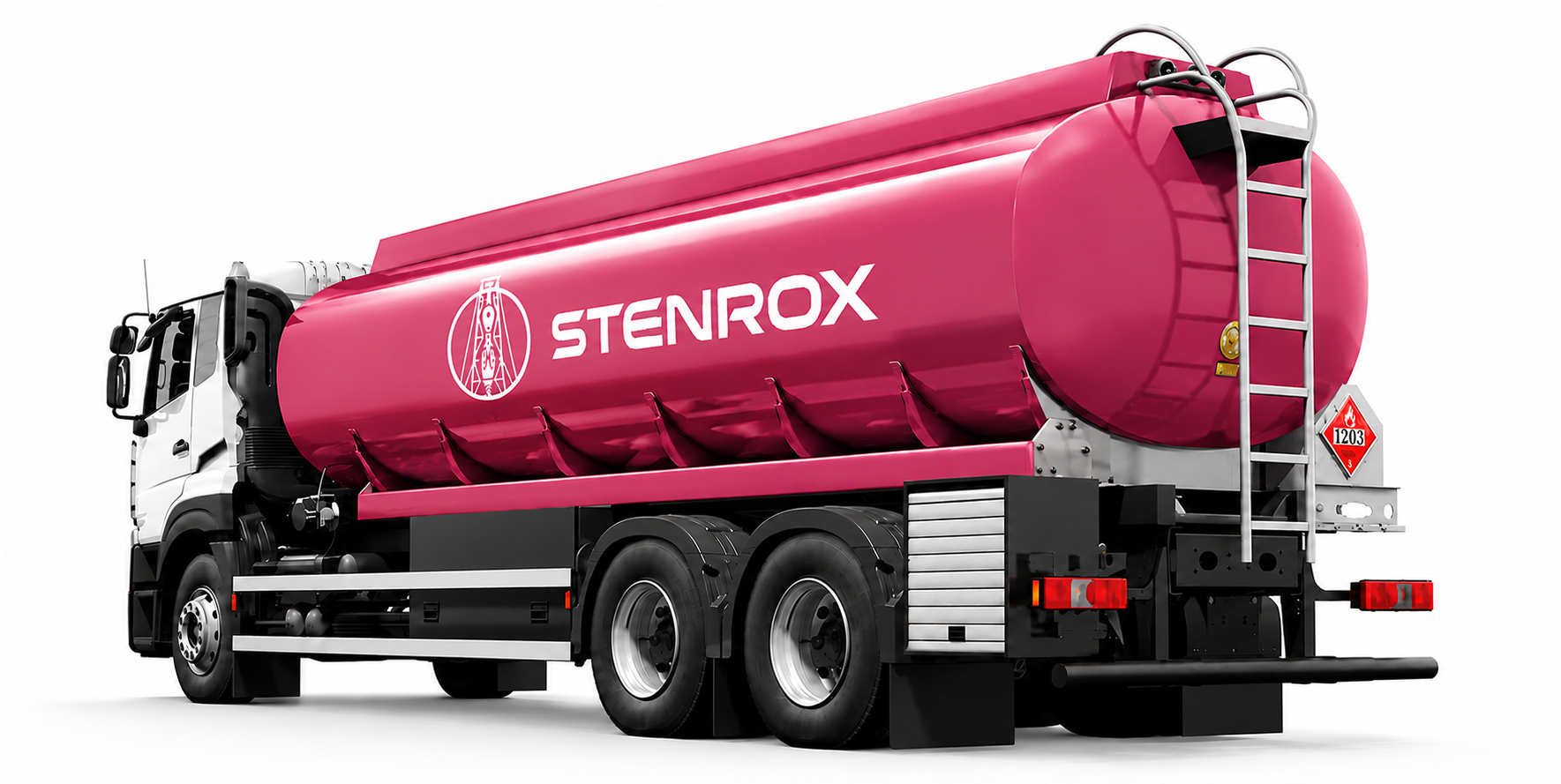
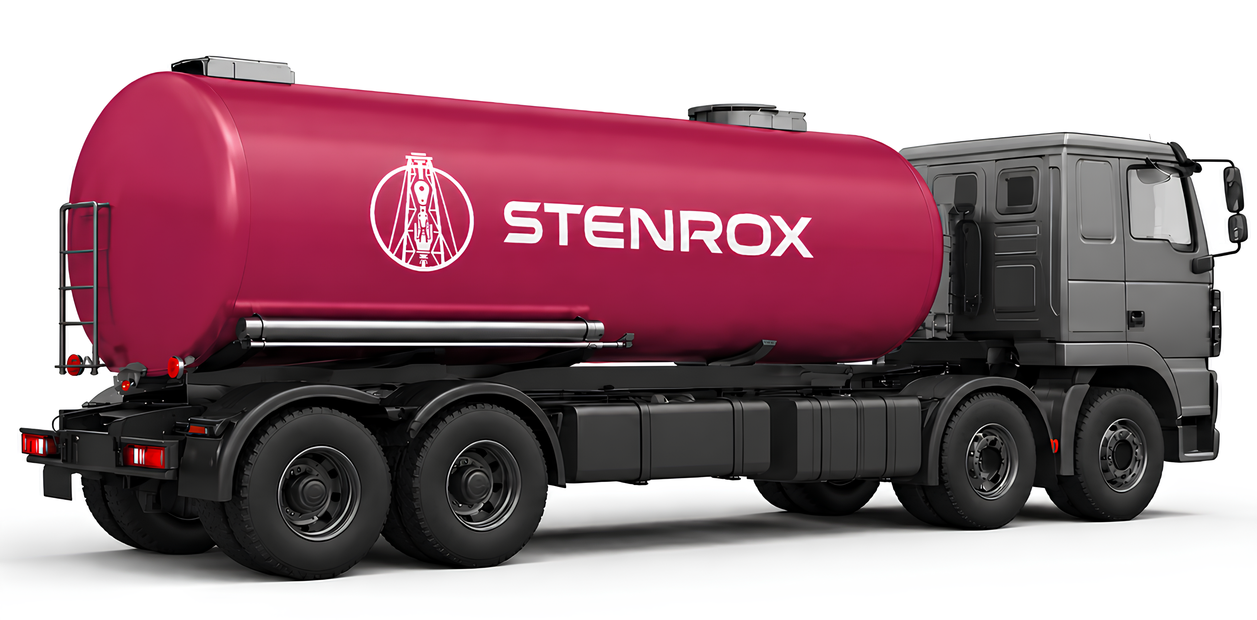
We rejected "oil black" as the dominant color — it made the brand heavy and faceless. The main accent is a deep raspberry red, instead of the expected black or blue. The typeface is Gotham Pro, a geometric grotesque in various weights.
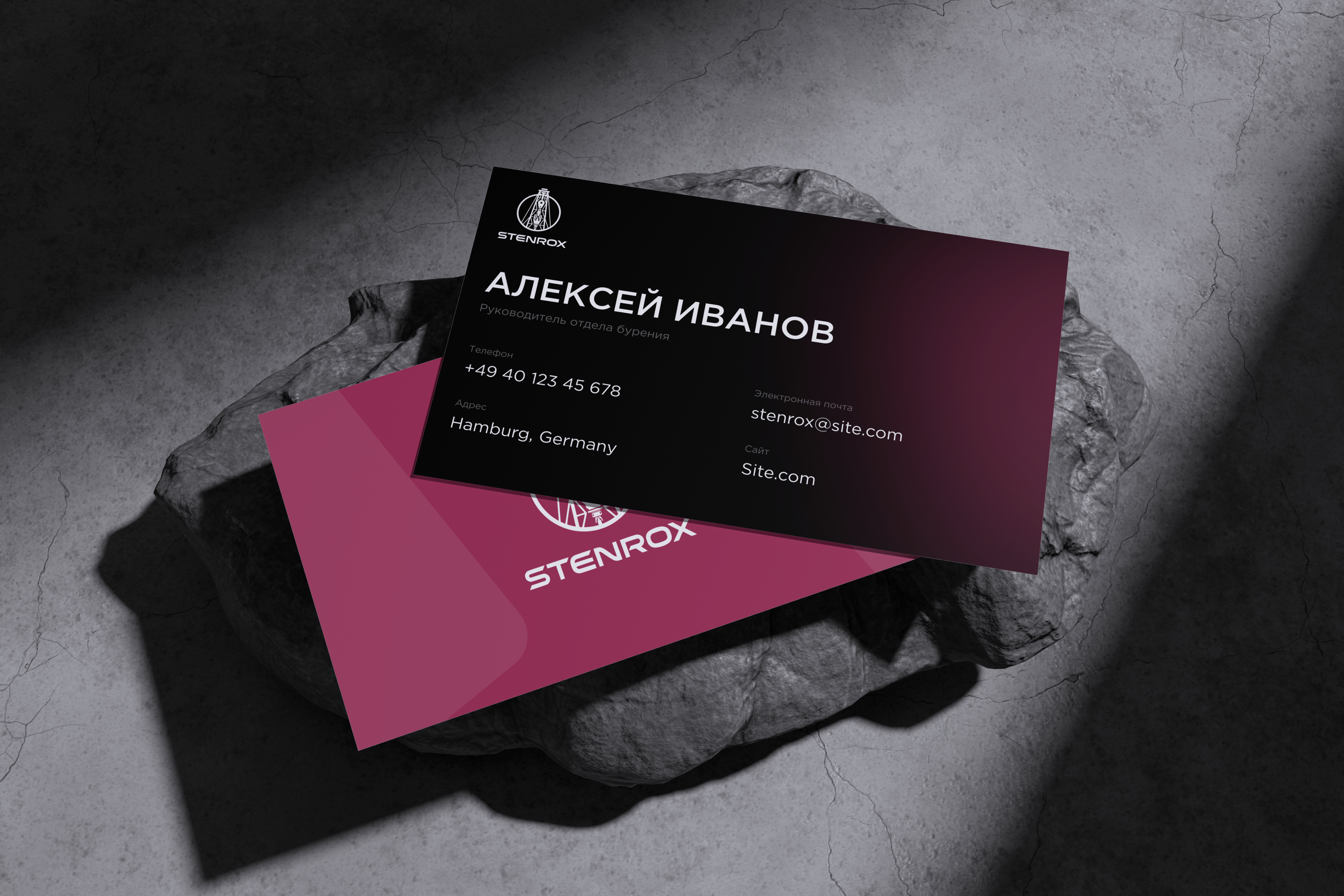
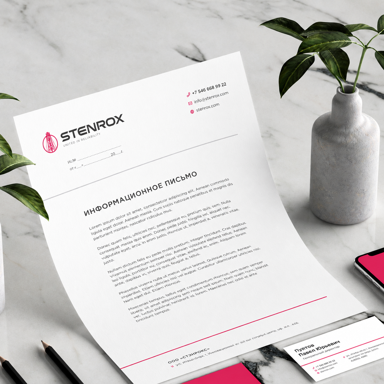
We combined the mark, palette, typeface, and usage rules into a single guideline. We designed a business card, a letterhead, and basic rules for the incorrect use of the logo.

Logo
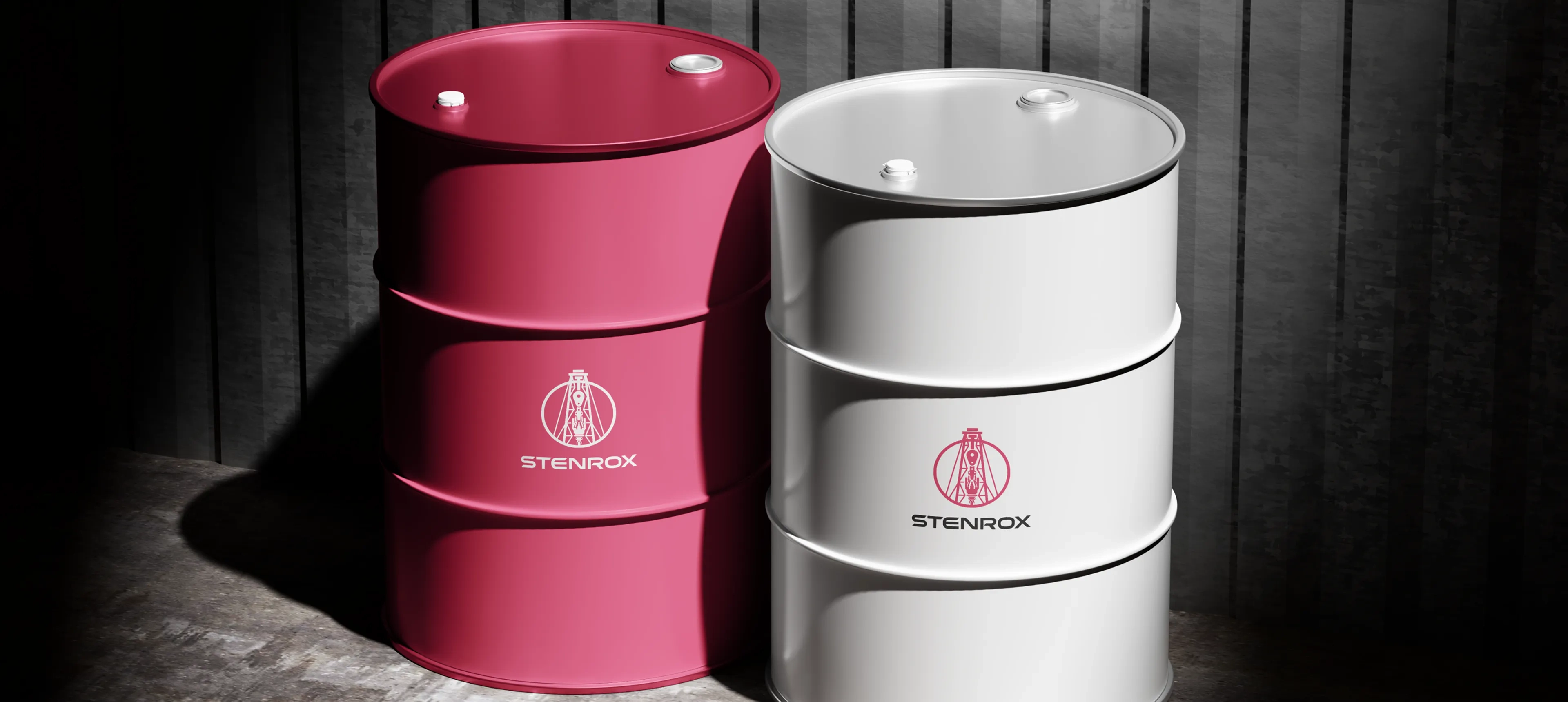
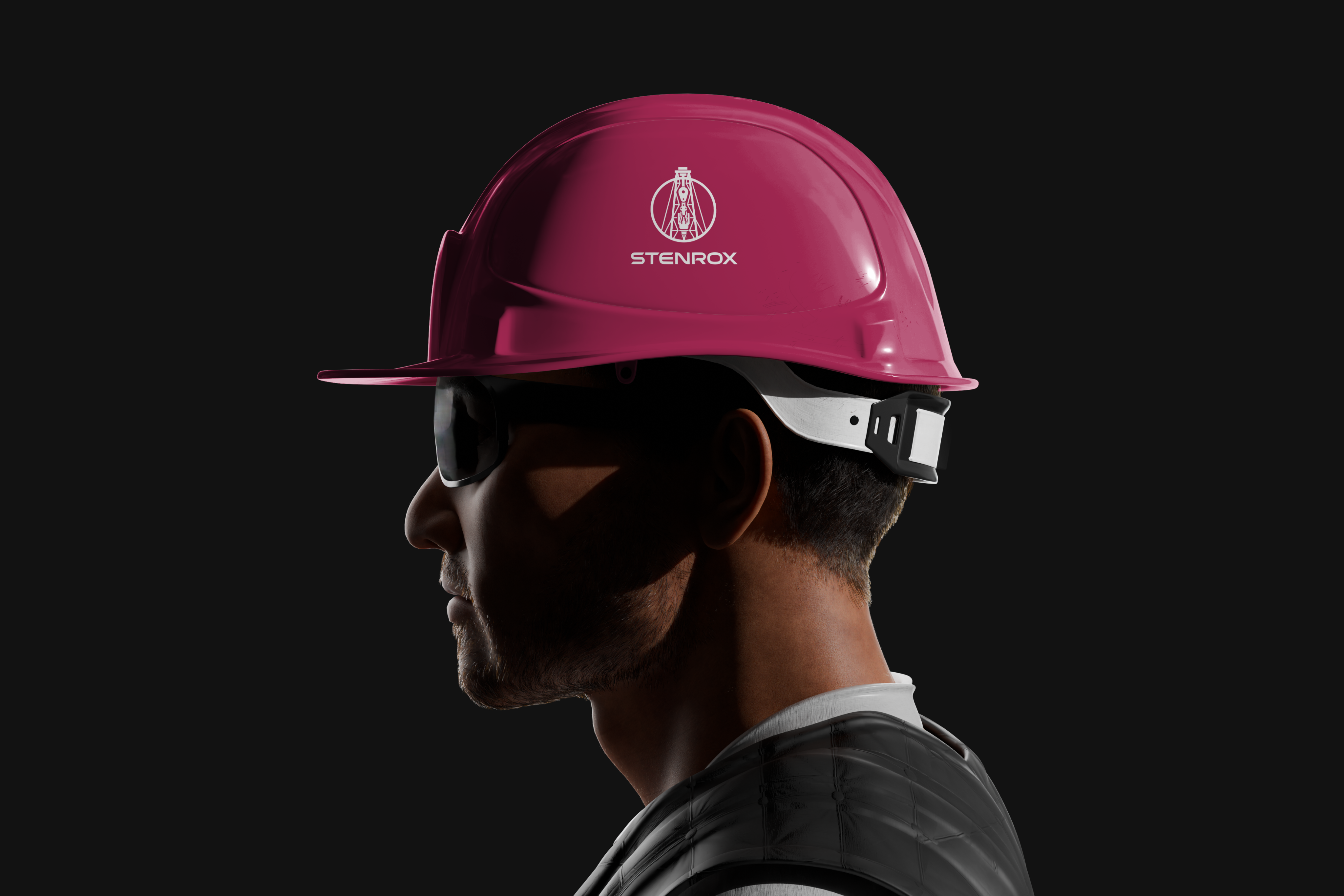
The brand mark is the silhouette of a drilling rig, built from thin lines and set within a closed circle. The name is set in Gotham Pro, a wide geometric grotesque, with the tagline "United in Reliability" beneath it in small, letter-spaced capitals. The whole construction works both as a full logo and as a standalone mark without text.



Style system
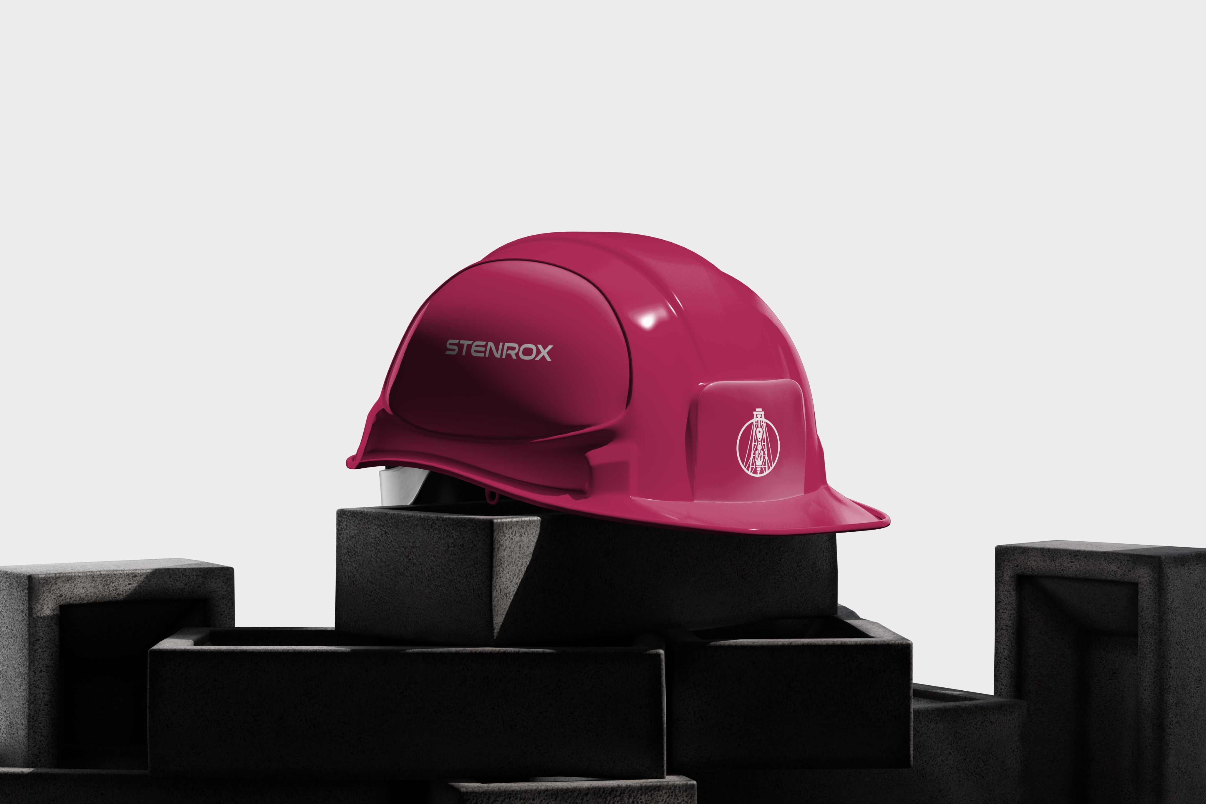
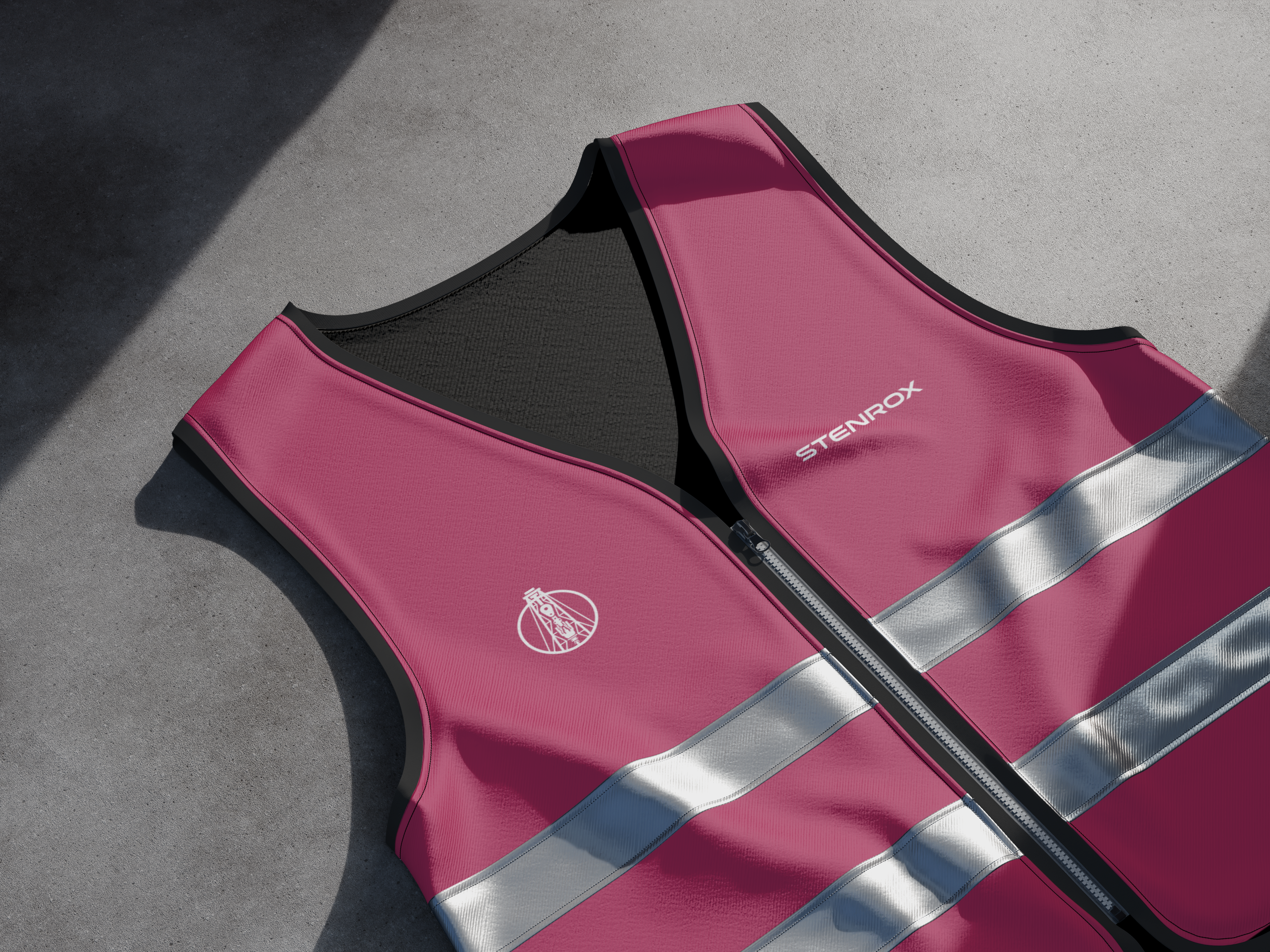
Raspberry red is the main accent — unexpected for the oil and gas industry, but precisely for that reason memorable. Dark graphite and neutral gray are for documentation and supporting elements. This palette sets STENROX apart from the industry's typical black-and-blue visual language.
RGB: 181, 44, 91
HEX: #B52C5B
RGB: 65, 65, 70
HEX: #414146
RGB: 158, 158, 158
HEX: #9E9E9E


Style system